EAOT + Photonovel Progress pt, 4
- Ahmad Ahseek

- Jun 3, 2021
- 4 min read
Updated: Jul 30, 2021
Photonovel
I completed writing the story, here is the remaining parts of the story in written form
Here is the rest of the story:


There's a section of the story where The Mad Arab would go into other dimension as described in Lovecraft's stories it's a dimension beyond human comprehension. Therefore I judge it would be better to use some Abstract photography for this section since it will have this feeling of being beyond human comprehension. Since it's an abstract photography I decided to use either all or most of the page for this section only just to show the details on the photograph.
There's only a small section of the story where there's a dialogue. I have in total 4 characters and I'll try to keep it as such.
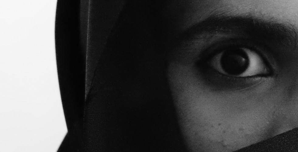
I took some pic using my Nikon P900 which has a wide lens with the Macro also to take the pictures. The wide lens is essential to try and achieve the Platon style of images, with the very close up features and to have the background element look further away.
Here's some of the shots for the first page:


I took some images by myself by calculating the distance, using a camera stand and having the camera on auto focus and using the timer. Other shots where I needed a perspective I had my roomates help to hold the camera and to adjust the focus the way I wanted the shot. Luckily I'm used to these 'self shot' methods xD
I did wore some foundation and an eyeliner to make the female character to try and give my face a more feminine look.
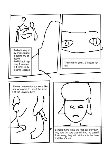
Here are the images that I've chosen to be part of the book:


And here's a look on how it will be when assembled. I still want to explore a bit with the text boxes, the frames and the font that I will use for this one

Beside that I tried to take some other shot where I used some techniques I've explored on how to have an abstract photography for the scene where The Mad Arab will go in the ethereal realms using the book.

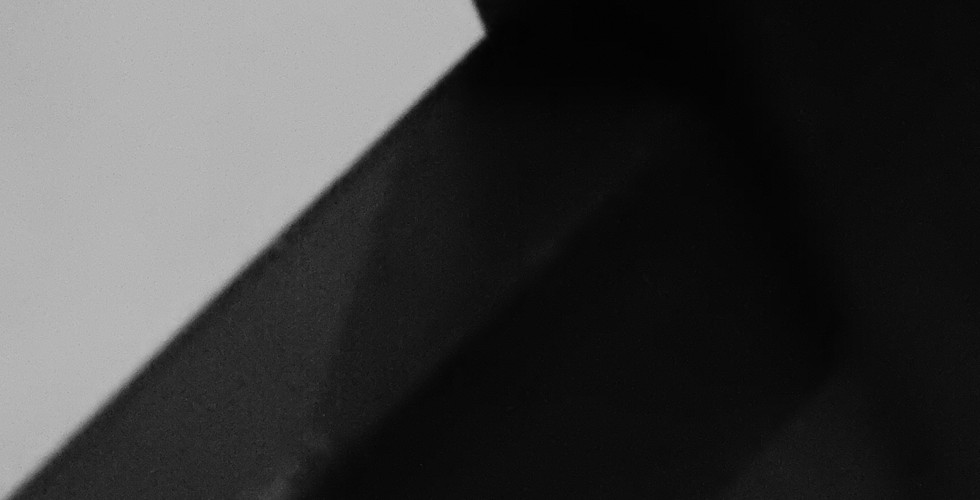


I took a few images of a table from very close to have some 'weird looking' structure to make it look like some architectural abstract photography in my own way, since I couldn't get abstract shots of building from where I am now with the lockdown.
I also took some close up shots of chicken meat, which I had available, trying to obtain some dunes, and make them look like Lovecraft's description of the Elder Gods, fleshy, gigantic and disgusting.
While taking shots of the meat, I found that by zooming very close to 2 chicken legs close to each other I could get a valley like shape that still look weird, that I will definitely use to show the weird landscape he visited in his astral form.
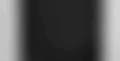
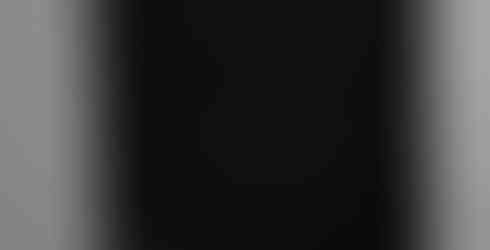
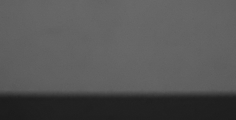
I also experimented on defocusing on my drawing tablet which is black in color and my wall which gave me something that look like a horizon which I will again use for the abstract piece. I've tried other defocusing methods but which didn't turned out quite as good.


Finally I had a scene where I needed a desert but obviously I couldn't get any desert during this time, so I explored with fabric but it had too much details on it so I explored sugar, but the reflection of the crystals wasn't something I wanted. Finally a shot with flour gave me a much better desert which played in my favor much more.


These are a few layouts that I wanna take inspiration from for the EAOT. I found the first layout interesting with this strip that follows around the magazine, it gives it a more funky/poppy look, which is the theme I'm going for with this project. I also think the way they laid out the images and texts is interesting too, but I might use another type of layout for the text since I want my design to still have some simplicity and free space wherever I can. From the 2nd reference, I want to use these, partly cut images along with maybe some tiny illustrations to divide the paragraphs. The next

For the fonts for the EAOT I chose the following, Funky Dunky for the titles, and Fraunces. The Funky Dunky looks very playful and still have some sharpness to it to make it look serious while the Fraunces is a very serious font, good for the text while still having some interesting alterations on the small 'f' and the small 't'.


Comments