As long as possible I tried not to use photoshop. I wanted to get the right shot with the camera itself to reduce the time of editing and so that I don't exceed the deadline. However, I had to edit, especially the pics took in the dark. They were at times too dark or noisy, since the Nikon P900 has a very horrible ISO.
Anyway.. I did it via Lightroom and synchronized it since most pic were taken with the same or similar profile.
Most of the time I just simply merge the images together for the shots where there's 2 characters interacting.
However, some shots required me to re-create the space in photoshop then merge the characters, which I did very simply with the 'Content Aware Fill'.
I also had this scene. The first image has my brother's hand in it, I took it as a reference. The one in the middle is the one he took. However I really like the defocus in the first image, so I merged them to get the defocus effect in the background.
There were also some pics that were a bit too dark which I had to manually adjust with a correction brush in Lightroom.
And in other pics I actually did the opposite where I made it darker instead.
There's also other pics that I simply cropped to get the effect that I wanted.
This one is actually one of the abstract pic, it was meant to depict a weird Valley made out of meat. The reason is that H. P. Lovecraft often describe such scenes in his books, for example the one in the story 'Dagon' whereby he describe; 'a landscape of putrid flesh formed into an expanse of monotonous undulations.'
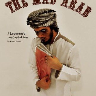
As for the front cover not too much editing was done. However, it was meant to look like a retro movie cover or poster to fit the fact that it's a story that happens in old days.
This was meant ot be the back cover. I actually took an image of a wall just to give it some texture in the background and I place the image of the Necronomicon at the back. Then I tried to apply the same hue as from the front cover. Finally there was to be a small description on the book below the image of the Necronomicon.
I tried to make the layout interesting and at time simple. I used different fonts for different characters. I used the 'Simple Chalk' font for the narration which is done by The Mad Arab himself and for anytime where he speaks, since it has a gloomy look while still having this comic-ish look and is easy to read.
Then I used 'Rockwell' for every other characters, like the audience or even the soldier and the woman. This one was because it also has a look that suits the atmosphere of the book while however being simple in a manner where it depict the simple peasants of the story.
Finally I used 'The Lucky Typewritter' for the King, since this font was bold enough, a fit for the king.


Comments