Placard Progress and GD Map beginning
- Ahmad Ahseek

- Sep 24, 2020
- 4 min read
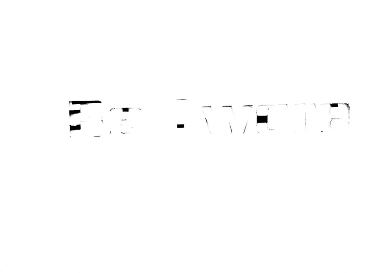
Since last time I got the comment that my designs were not reflect the human part so well I tried to apply the things that I've learnt recently to gain a more RAW effect with it thereby illustrating more that human touch/approach to it.


These first tryouts were simply obtained from the template I created for another idea I was preparing out for but I took the opportunity to experiment with while it's still clean.
I tried to show how the letters are dismantling by hiding it's lines with the template giving an impression that it's falling off to represent again landslide.


So I used the template I created to obtain the exact same font but with this irregular stroke effects to make it look less digital. I actually played with the amount of water but still I haven't obtain the textures that I was seeking for on it.


This one was made using colored pencil to give it even more texture and thereby creating a much more raw effect. I did experiment with the template if you look better you'll notice how some have a gap and others don't.


This was the template after I was done with it, I kept it so that if any inspiration comes from it I could use it but so far it doesn't seem to illustrate my idea about infrastructure and the bad effects on environment so well.

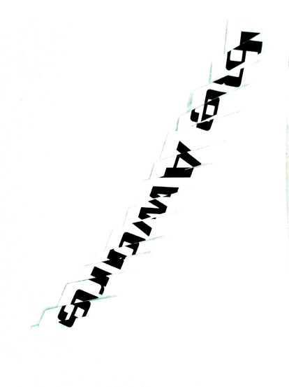


These ones were based on the first idea I proposed from the last progress, but it's not done digitally this time. There are some that I played with it by rotating the sliced part upside down to illustrate a flaw in the creation of the typo and thereby a reason for it's collapse similar to how we use our technology to show our advancement and affluence but we don't take into consideration the environmental effects.


This one is the one that I'm more proud of, since it really depicts that human touch to it, it's really raw. It also illustrate well the flaws in the creation of the typo and how it hasn't been repaired correctly. It could relate to the article that I read about how Dubai tried to create an artificial ecosystem to bring back marine life where they created the man made island but in the end ecologist found theories suggesting that on the long run other flaws might be revealed.
I don't know how noticeable it is but I tried to play around with the lighting while scanning the images.


This is two sketch I came up with. The first one having skin all over to illustrate the harm that a bad infrastructure, here represented by the typo can cause to us humans.
The second one simply has a ground background relating it back to nature.
For the typo I cleaned up the white areas of the typo while keeping the color of it. But then to relate it more to infrastructure I added a concrete texture that I've create in 3D for the previous progress 3D sketch. I haven't applied the texture on the pieces of tapes since I wanted to keep the original raw texture of the tape along as it's color to really keep that human touch to it. I haven't applied it neither on the stitches

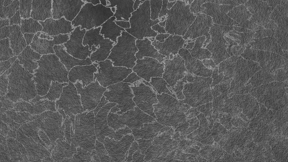
The texture I applied on the text


This is the text that has been cut out. I've adjusted it and since it looked boring I added the same texture but as background.


This one I used the text I made using colored pencils, I've trace it in illustrator and extrude it in blender. I found this background of a broken bridge to help relating it. I also kept a few dark spots on the typo since I felt it gave it an interesting appeal. The little whole within the typo sort of help relating it back to the infrastructure. However it gives it an aging look.

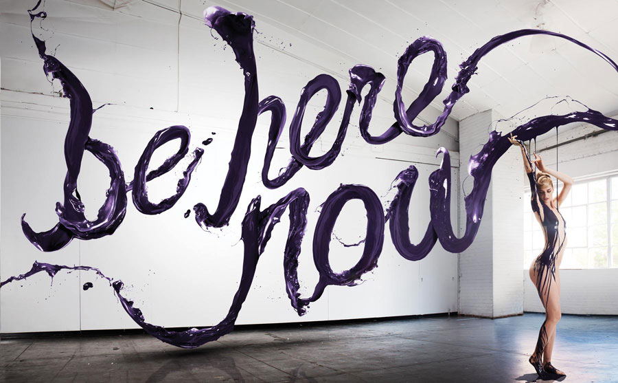
This idea was actually influence by this design by Stefan and Jessica where they combined 3D and photography together. My tryouts wasn't so mesmerizing tho.


I've got a couple of ideas that I haven't tryout yet, this include a photography of the typo similar to other Stefan Sagmeister's work.
The idea consist of a 3D physical text photograph close to a stair since it's a man made infrastructure but it's actually time consuming to create the 3D text with paper making the net development of it and all, and if I do it with wood which will spare me the need of a net development, I don't have the appropriate equipments and it will definitely be much costly. I could also use a flat text but it might be boring due to the lack of details.


I also had the idea to attempt something like this with the flat typo which might make it more interesting. However replacing the background with a view of the city I can get from my apartment and the text will be simply be made out of paper and be glued to the window for the shot. An entirely photograph typo with perhaps some lighting adjustment on photoshop.


You might wanna zoom in to read the text but basically this is for the GD map where I expanded all that I'm interested in and also tried to relate it to some visual such as body part since I focus a lot on humanity and psychology. There's also another interesting interpretation I got from a song.
Tel un engrenage fragmenté,
Fracturé comme l'homme et sa duplicité
J'ai les yeux rivés sur ce qu'est notre société
Beyond Creation - Le Detenteur


Comments