We had a Typography workshop today whereby our lecturer showed us how to mix physical work and digital work together to create various effects.
I started with a very simple layout by overlapping each page over each other and placing some objects then scan it using Adobe Scanner on my phone.
Then I started experimenting by cutting them out and overlapping.
After that I started to really experiment with it, by crushing part of it, changing the angle at which I'm taking the pic, playing with light effect, having light beneath it, moving the light beneath it. This technique ain't much visible since it only affects the texture of the typo instead of the whole paper, it wasn't much of a success afterall. I had only one pic where since I was close to it, it darkens and the light source is visible else, from the other tryouts you can't really see the light even though it's there beneath the paper.
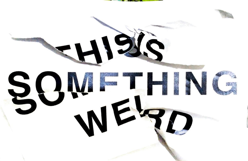
I tried to do a few more interesting techniques such as twisting the paper and take instead of crushing it, folding it, crush the whole thing and the last one is one of the most interesting since I wetten the paper and scratch it till the lettering is spoiled and even making holes through the paper.
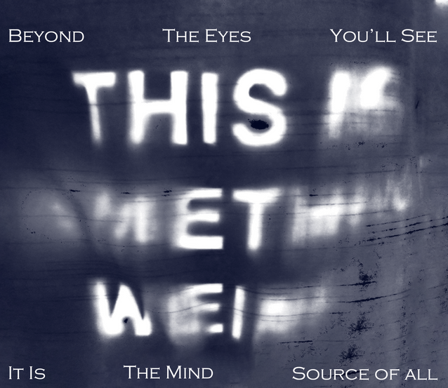
This is probably the most interesting thing I did whereby I made a stencil out of the paper and pin it on my curtain and scanning the light effects on it, I even change the paper to remove the mirror effect afterwards.
This is the first idea I came up with, really silly since we didn't had to do anything specific.
The second one where I tried to make the crushed paper look neat.
This is one that I did with the light and tried to make it into......... something..........
Of course this one had to be more dramatic since is look mysterious and emotional, however on the next pic, I tried to make it into something psychedelic, using it's soothing pace into a more energetic way, if it makes sense.
These are some other ones I had that I wanted to include however I didn't had much idea on how to use it. on the first one I just remove the edges by cloning it which gave it an intriguing cloudy effect, but for the rest, I simple played with the level and turn it into a Swiss Design style just so that it still look interesting.
Here are some experimentation I did with the colors. Most are with the shadow one since it was indeed the most interesting one to explore.
The class actually gave me some insights of what I can try for my placard.


Comments