top of page

Week 8 Reflection

  • Writer: Ahmad Ahseek
    Ahmad Ahseek
  • Oct 13, 2020
  • 2 min read

We had a quick Marketing workshop where we had learnt about the company as being the center of interest and the outlying areas whereby a company is found, most notably, the micro environment and the macro environment.


The Micro Environment consists of the Porter's force which involves:

  • Rivalry

  • Bargaining Power of Buyers

  • Bargaining Power of Suppliers

  • Threats of New Entrants

  • Threats of Substitute

And the Macro Environment which consists of the Pester's Analysis:

  • Political

  • Ecological

  • Social

  • Technological

  • Environmental

The speaker told us that there's a few more in relation with the demographic and so on which is included in the pester's analysis but since this is the simplified version so he didn't include it.


After that, as always we were divided into groups to work on a small activity where we had to research each of these areas involving a particular company.


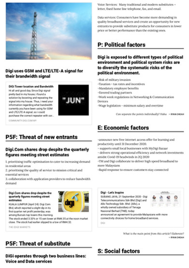
My group has been given Digi and we divided each research area among ourselves.


These are my research part and I've been given the comment that I should perhaps research beyond the Digi website since from their perspective everything they're doing is good even tho it's debatable which I totally agree but due to the lack of time I could explore more.


And this is a compilation of everyone's answers.


Then we had a sharing session with Melissa Chan a multi-disciplinary designer and tbh I've really enjoyed her works.


This is an installation she did where she played with words to create the visuals and actually this project ain't just a space. It's actually an interactive space where from the flyers given to the audience there's some clues and an area to write for the people to guess the items they see in the environment. Some are actually on a video and that's why there's the mac in a corner.


This is a logo she did for a client, a pizzaria obviously. This one the lettering she chose is a modified version of some existing typo but it actually to represent the melted mozarella and the fact that the pizza crust there were made by hands over the pizza which is interesting and furthermore, she did a pattern based on the grill that they use there to cook the pizza and it was just a pattern that they can add in the use of their logo but since the interior designers had an issue with a part of the pizzaria, this pattern proved to be the right to solve this issue which included her work as partly interior somehow...which is indeed fascinating.


This one is quite simple but I like the concept behind it, I guess it's pretty straight forward with the house and the curve.


Comments


bottom of page