I started off by thinking of a proper symbol I could use in the Info graphic something that relates to spirituality and also allow me to divide it in different parts.
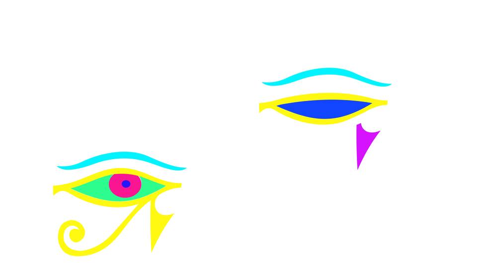
This is the sketches I came up with, basically using an eye since it's a representation of awakening and often used in various spiritual context. I tried to find a way to create some divisions on the eye and I've also thought of a division in between to act as a rating of the people's satisfaction level. I've got an inspiration from the Zen symbol.
The next idea is just a tryout basically it was supposed to form a vortex which is often used as an indication of a gateway between the physical and spiritual realm. However, since I lack a variety of people it wasn't forming the circle in the middle and honestly I'm sure that this idea won't work.
This is an example how the sketch above will look. I also thought of making a closed eye to represent the none believers.....but......... IT LOOKED JUST SO WEIRD.
I tried to keep the same eye concept but this time I used the Eye of Horus instead which already had some divisions. I also did a closed eye version for the none believers. However, after a tutorial with my lecturer, we agreed that this will not work, he told me to keep the Zen element in between but to try and change the symbol, either find a simple geometrical shape that will work better in this environment rather that forcing myself to find a symbol that will just make it look off.
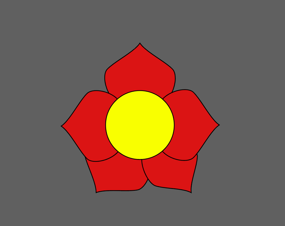
However I came across the Mandala which is often considered as a sacred wheel in Hinduism.
NOTE:
I also had a few challenges while plotting my data, especially when it comes to sort of point out something with it. It was actually due to the fact that I missed a few data from my survey, information such as the level of satisfaction of each individual even the non believers and non practitioners. So I ended up rejecting the non believers and focusing myself solely on the practitioners and their level of happiness because I had asked only practitioners about how they feel about their life after they started practicing. Therefore I could rate their level of satisfaction based on that.
Back to the design......
I actually took a Mandala and simplified it, so that to remove unnecessary section from the wheel, in order to have the data potted exactly in the right sections.
This is how I've divided the sections and the colors I've chosen. The back text represent what it signify and the white text is the inspiration, like the reason why I chose this specific color. The interpretation were taken from both various religious believes from islam and hinduism and from some general interpretation of colors in order to have a variety of meaning behind each of them.
This is a quick sketch on illustrator of how it will look like in practice. There's some labelling of the sections of the infographic to better define the reasoning behind the design. The color of the background was made lighter so that it doesn't merge with the bright colors from the Mandala.
However.........
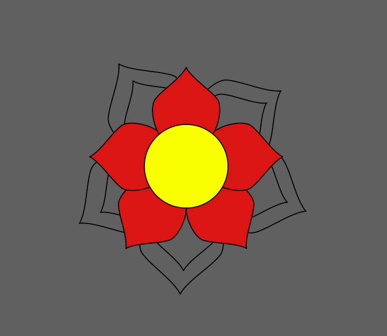
After another tutorial with my lecturer he said that the aspect of the mandala isn't seen at all since it has been drastically simplified. Which affects the concept.
So I was told to keep the complexity of the mandala and plot the sections on the various layers of the petals rather than on just one petal this time. This is a quick sketch to give a better understanding on how it will be developed.


Comments