Everything Connects Progress
- Ahmad Ahseek

- Jul 17, 2020
- 3 min read
After a lot of research I've finally chosen to follow the following when it comes to the content:
Definition on Localization
Deeper explanation on Localization
Differentiation from Globalization
Case Study
The case study will be based on Starbucks and will be as follows:
How they had to adapt to a culture
How they had to respect some religious views
How they've adapt Visually
Website Layouts in different countries
For the format and layout, I decided to go for a normal A4 which open up to an A3 leaflet with an interactive rotatable world that will pop up on the side since it's about localization.
I referred myself to this design:


This is the first mockup
The green squre on the top was actually yellow but since I choose Starbucks as my case study I turn it to the green color of the logo.
The blue square is the definition of Localization.
The green square is a deeper explanation of Localization
The red square is how globalization and localization differs from each other.
The yellow square is the first case study based on how Starbucks opened it's first restaurant in Italy which was a great challenge for them since Coffee was taken very seriously there.
You can see the interactive rotatable earth in the mockup.
The red pointer with the writings on the left was actually supposed to represent the Western culture, and therefore there's a lot of random English words written on it.
And at the bottom taking both pages there's a few Location where Starbucks operates.
There's a half cut of the Starbucks mermaid on the left.

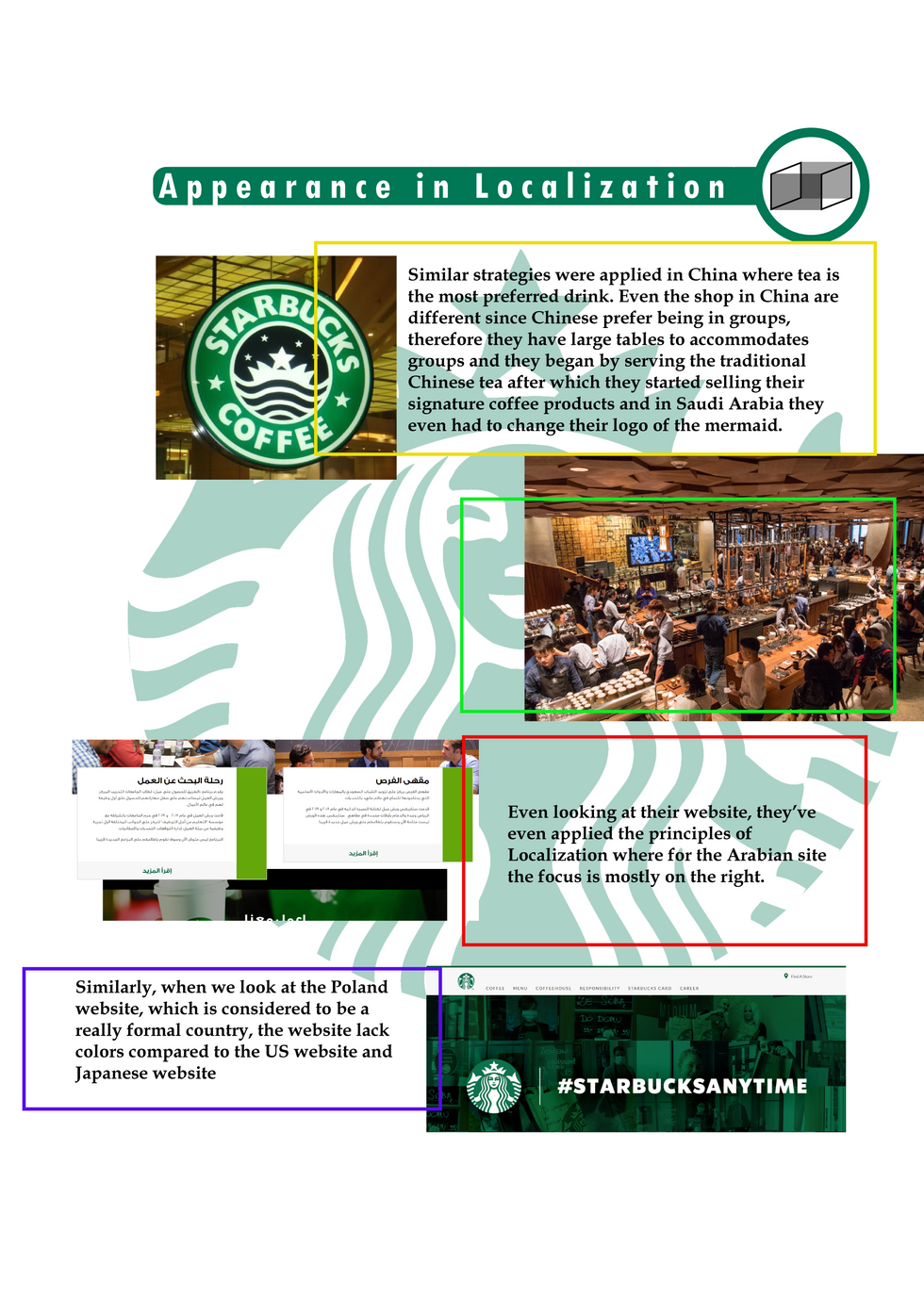
The yellow box explain how Starbucks had to change their logo in Arabia because from the religious view the mermaid was seen as an obscene image.
It also explain how in China the interior had to change to be able to accommodate large group of people because Chinese like to share their dishes and also how they had to serve tea for the first time since tea is the preferred drink there.
The green box is the image of a Starbucks restaurant in China.
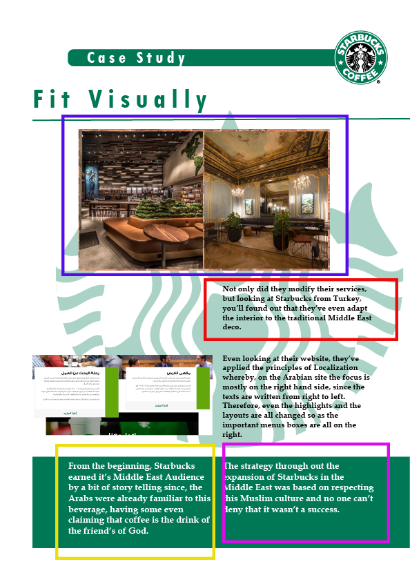
The red box explain how Starbucks had to adapt their Arabian website to fit the fact that in Arabic we start writing from the right to the left.
The blue box explain how in Poland people like to be very formal and therefore the website is extremely simple and formal.
This one actually featured a full image of the mermaid in the background.
References;
After a tutorial with my lecturer she said that she feel like the interactive globe makes it look like it's more related to Globalization rather than Localization and that I should change it, and we come up with the idea whereby I'll focus myself on just the Middle East and the interactive element will thereby be the Arabian Starbucks Logo which only few have seen.
So I had to modify the content of my leaflet.


I had to do more research on the Middle East and I actually found this article:
I kept the paragraph on the Logo in Saudi Arabia and I actually removed the part where I talked about China and extend it more on the story of the logo.
The blue box still talks about the website layout and again it's more focused on just that story.
The red box talks about the few other things that Starbucks did to further integrate in the Middle East culture.
If you look at the title you'll notice the illustration of a transparent cube this is actually to depict appearance, I just came up with this.
This time, I was told that my information are a bit all over the place and that there should be an order in it.


The new Mockup


Discover the power of connectivity in driving progress and innovation across all aspects of life. Explore how every element is interconnected, from technology and science to culture and society, shaping the world we live in. Embrace the idea that everything connects, propelling us forward towards a brighter future filled with endless possibilities. And for businesses seeking to communicate their role in this interconnected world, consider the professional video production services offered by 3DTRIXS to convey your message with clarity and impact.
Thanks for sharing. Village Talkies a top quality professional <a href="https://www.villagetalkies.com/"> Corporate Video Production Company in Bangalore </a> and also <a href="https://www.villagetalkies.com/explainer-video/"> best explainer video company in Bangalore </a> & 3d, 2d <a href="https://www.villagetalkies.com/animation-video-makers/"> animation video makers in Bangalore </a>, Chennai, India & Maryland, Baltimore, provides Corporate & Brand films, Promotional, <a href="https://www.villagetalkies.com/marketing-videos/"> Marketing videos </a> & <a href="https://www.villagetalkies.com/training-videos/"> Training videos </a >, <a href="https://www.villagetalkies.com/product-service-demo-videos/"> Product demo videos </a> , Product video explainers, 2d, 3d Animation, Motion graphics, Whiteboard <a href="https://www.villagetalkies.com/employee-videos/"> Employee videos </a> and more for all start-ups, industries and corporate companies. From scripting to corporate, explainer & 3d,<a href="https://www.brandanimators.com/"> 2d animation video production </a>, our solutions are customized to your budget, timeline and to meet the company goals …