Portfolio Progress
- Ahmad Ahseek

- Jul 19, 2020
- 3 min read
This is a brief planning of my illustrations and words for the portfolio


I know it's hard to read 😂 😂 😂 but I'll try to explain
So I said I'm gonna do the following Manisfestos:
Adapt
Understand/Explore
Learn skills & philosophies
Accept the undefined
For Adapt: My idea was a person deforming to be re-materialized.
For Understand: I thought of a bird and in fact I found that the bird that travel the longest distance is the Artic Tern.
Learn: Philosopher's Stone, Kabbalah, Books
Undefined: I thought of a deformed portrait, like maybe one done with watercolor.
Some are just keywords that I'll use to generate ideas.
I've also changed the form of writing the manifestos:
Adapt: Deform thou thy Flesh to be Reborn Again.
Understand: Venture thou into the Unknown and Let the Unknown be thy Might.
Learn: Of the Many Things of the Earth and the Sky Shalt ye Gather for thy Life.
Undefined: Ex Nihilo Existere, Be thou as Shapeless as thy Creator.
Here's for the exciting part; All the illustrations 🤩 🤩

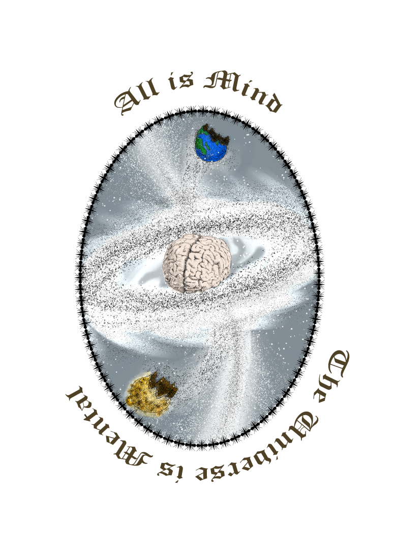
For the title, I did a galaxy but instead of a back hole in the middle, there's a min and not only there's this burst of energy from the middle of the galaxy but it's also creating the sun and the earth to represent that it is responsible of the universe somehow. And it states that the world is what you want it to be, and to me, since my believes keep on changing, it means that the world I see will change as well and that I have to adapt to each phase of my life. This quote also depicts the fact that I love when my work keeps on evolving and just like my ever changing believes, it’s never the same boring work. Moreover, it illustrates how I like spirituality, that occupies a major part of my life and also how I like anything that is conceptual.

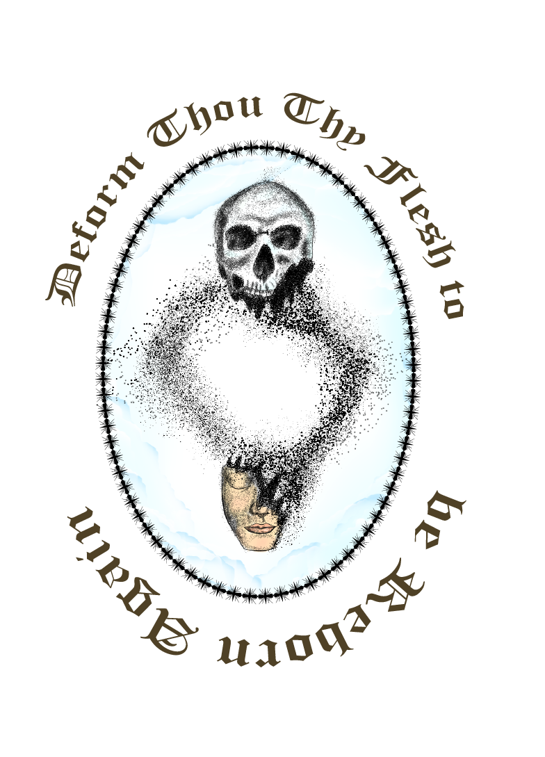
For the first manifesto it's a skull, which represent old that is dematerializing and re-materialized in a new human face, and the quote suggest that one must forget who he was to become someone new. Thereby, demonstrating Adapting.

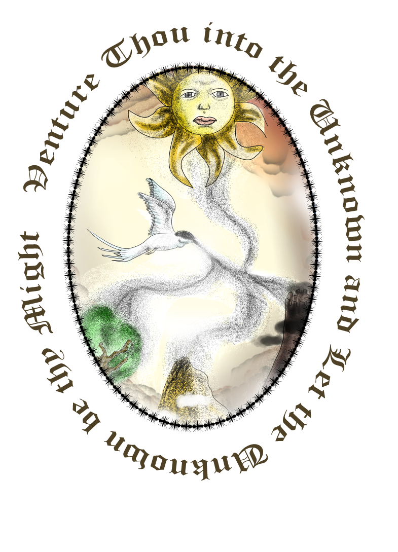
This one shows various environment at the bottom and a sun releasing their essence and an Artic Tern, the white bird with a black head is absorbing this energy and since the bird's head is already black I thought that in someway it will illustrate that the bird is understanding these various different environments. Furthermore the quote illustrate that you should make the unknown become your strength, thereby depicting understanding through exploration.

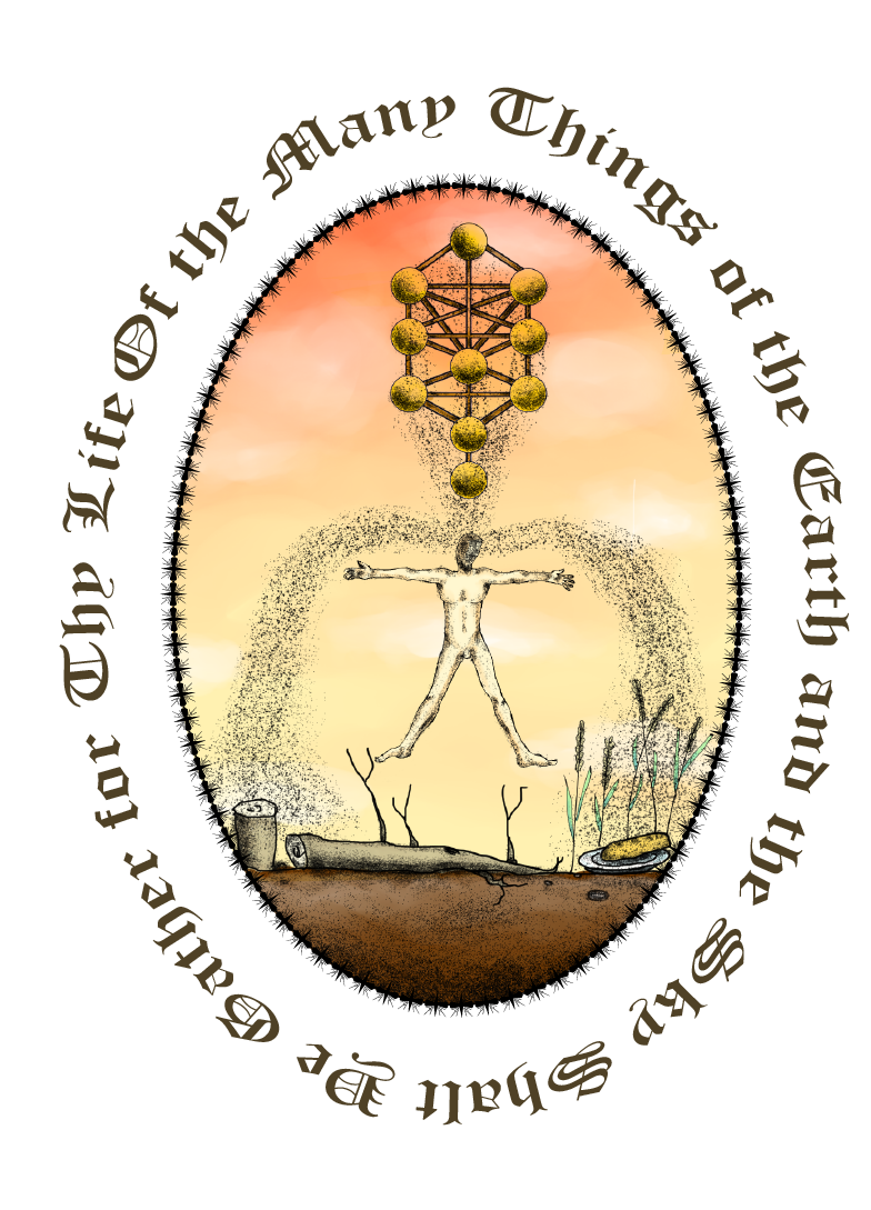
The structure on the top is the Kabbalah also known as the tree of life/knowledge and on the earth there's a cut down tree, that represent craftsmanship and the bread on the plate along with the wheat represent the skill of cooking and plantation. There's a man in the middle, absorbing all of these information, therefore he's learning various skills and philosophies.

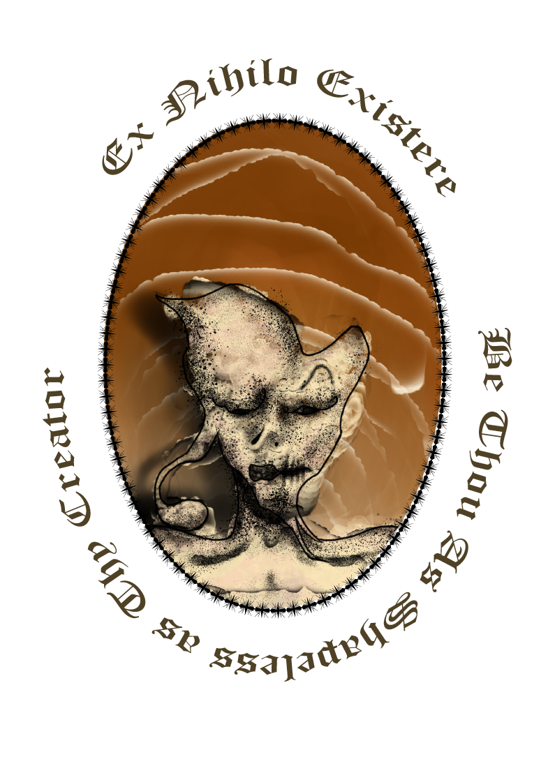
This illustration shows the portrait of an overly deformed man that no features of his face is identifiable and the quote suggest that since we're born from the nothingness we should be shapeless as in being undefined and not being labelled or categorized cuz I believe that each person can be in various categories at the same time, we are not just a good person or a bad one we are both and even more.

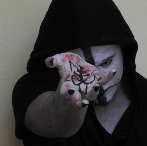


This is a image of me from a personal work I did in the past where I painted my face to attempt a conceptual photography. I've just cartoonized it and use it as a final illustration. I've also added this quote from Aleister Crowley which is inspirational and still remain in that old English form.


I've used the following first since it was the So I had to modify them into this form to gain
originals but they were all irregular. some consistency.

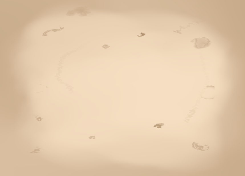
This was my background I did it so that it looks like an old parchment paper and I've always use the color scheme I talked about from the previews posts. I also had a specific pattern that I did that will preserve the theme if you look up at the drawings.


To begin with these are the fonts I used But since it was hard to read I changed it.


I tried the following fonts but I end up using this one instead:


I also did a 3D mockup of my 'Sitecore' Project to make it look more professional and neat using blender and dimension.


I also edited my experimental mapping project since I couldn't obtain a good lighting and enough paper to hide unnecessary details in the background. I've just removed the background and create an artificial plain empty room and I've also added a shadow. Still not perfect but at least it's much cleaner.


Comments