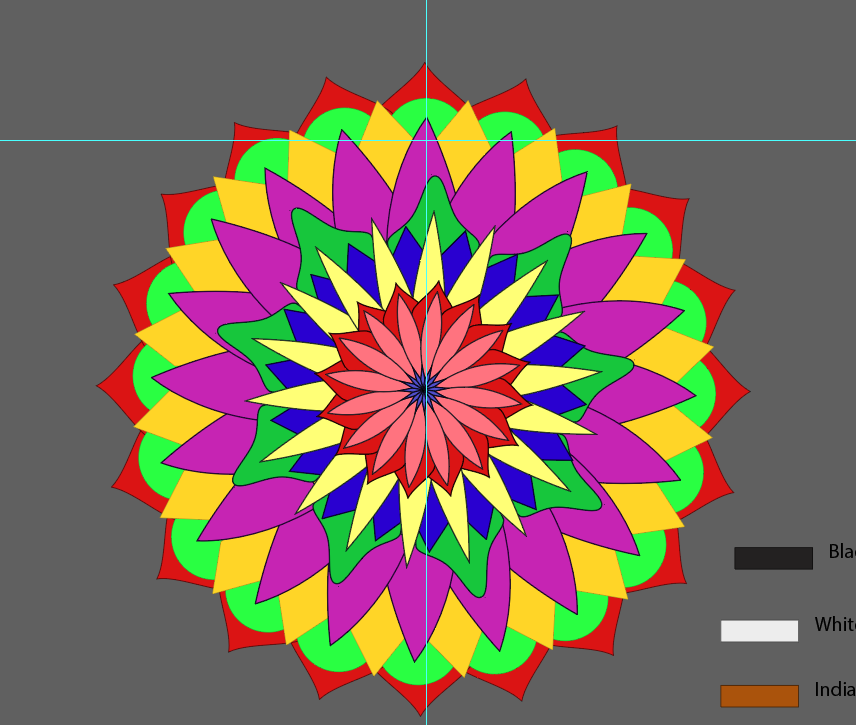
I had to modify the mandala but I kept the same concept and I tried a layout that will enhance the look. The colors here are still messy, but I simply did the basic positioning of the elements.
I used a bigger Mandala as an aesthetic element which also contributes to the legend. I was thinking of adding some specific answers that I got from interviewing a spiritual practitioner but I've actually forgotten that I need to write a few sentences for the Infographic and add a title to it.
I've reduced the size of the grey area since there was no one who had only negative comments from the survey. But during the tutorial I was told to completely remove it since it doesn't serve any purpose now.
BEHIND THE SCENES
Actually... the mandala was supposed to end at the pink/magenta section before the deep yellow one. However, I designed this one since I wanted to add each answer of the individual, since, for example, a few of them said they found peace but feel odd.
However, this method proved to be not so convenient since, firstly, I'll have to create more color coding and there were some people who selected over 5 answers, I would have lack color from my palette. Secondly the shape of the Mandala wouldn't be proportional and might even create some confusion.
So I did a scale and code it with colors. So if their answers were mostly positive it will be green and so on as you can see there. There's an empty square rated from 0-1 just to add the emphasis on the fact that their was no fully negative response. Each practitioner has found at least 1 positive response.


Comments