Pavillion Pillar Design pt, 1
- Ahmad Ahseek

- Aug 6, 2021
- 5 min read
We've been given this brief by Pavillion Bukit Jalil. They had several zones there where they have a few pillars. They've actually given each zone a theme which represents their brand values.


As always we started off by making a mindmap, where we saw each of the different zones we were given, Sustainability, Food and Connectivity. We related each zone with different possible visuals and we also made a few research as to why are we deciding to go with this direction for this zone. We also take into consideration the colors given by Pavillion as their brand identity.


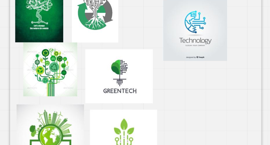


We came up with these ideas for the Sustainability zone, which represent one of the world's most polluting thing, electric circuit boards recycled to form a tree to represent that through recycling we are growing as a green society.


We came up with a few moodboards like here for the Connectivity area.


And we came up with a few sketches for the connectivity area. The first idea was inspired from the spiral when there's a vortex in water, since they all converge to a specific point it's a representation of connectivity. The next design was inspired from Pavillion's display of connectivity which is made of prisms. Then, I thought of a few ways to make it interactive which was a bit too crazy and not so realistic.. and yes.. that ugly design is mine not the first one. XD

Pavilion Display of Connectivity


Here's another moodboard for the food pillar.

Here's another moodboard on the overall aspect observed in Pavillion.
At this point we had a tutorial with out lecturer where he said that our design has to be connected conceptually and have a sort of story telling to it, so we had to change our approach.
After thinking about it, we realized that these 3 themes can be somehow connected together with the ocean. Sustainability can be related to pollution which includes the ocean too, the ocean connects each country together and finally there's food from the ocean.


The new mindmap which explains how we got the concept and everything.
... And we encounter another issue. Just in the middle of the process of this new direction Pavilion suddenly changed their brief. Now we were require to work on these 3 theme, Malaysia, connectivity and food. We actually also learnt that for the zone for Malaysia and Food we simply have to make a printed wrap up and for the connectivity zone we have to make a 3D structure.
We finally decided to go forth with the idea of the ocean since Malaysia is also know to have nice beaches.


For the Malaysian Culture we made a wrap up that was inspired by the Malaysian Baju Kurung and we just simply made it to appeal as the reflective stripes that appears on the water of the sea at the beach. The member who worked on that part also included a traditional version of the design, and one made traditionally but which the color of the ocean.


And this was the design for the food section. The ones on the left is the design while the one on the right are just the inspirations.


This design was inspired by the idea of waves crashing to represent connectivity. The designs that follows are mine, which are inspired from the idea of waves crashing too. I took a very literal visual of waves crashing which I started deforming into it's wireframe and a version made out of wood which looks even more abstract.
However, out of insecurity I also added another design that was in no way related to oceans but was actually related to Malaysia itself, whereby I exclaim how Malaysia connects different countries together.
The comments this time was still not positive. We were told that the designs have a better connectivity but still lacks a statement and a story. As for my design of the Malaysian concept I was told that it looks too much like the decorations of the independence day in Malaysia. So eventually we decided to change our approach completely to make sure we can put a better narrative to it.
So we decided to relate everything to Malaysia itself since it seem to be the easy way to go around with the situation. This time we went straight into the designs. Since we already had our starting point.


This is the first design that we did for the Bazaar. We actually got a comment that Malaysia doesn't only have sea food dishes so we change it.

This was the new design where we put more emphasis on the noodle dishes instead.... but eventually Pavilion told us that they don't want to put too much emphasis on Malaysia but they're focusing on an international audience instead.

This was the first design for the Malaysian culture, we decide to display the 3 main religion here in Malaysia. However, we were told that it lack the harmony from the previous design, the one with the food.

So we changed it to this version where all the elements from various religions are all together in one same canvas.


As for the 3D structure we were all confused as to what can we do. We finally came up with an idea whereby we had some statues representing different religions together around the pillar to represent both connectivity and the Malaysian culture.


I had to change the design since the very first one was connected to the ground which was considered to be dangerous. In this design each statue were designed in a manner to represent a religion while having a modern abstract statue appeal to it.


Pattern for Hindus Pattern for Muslims Pattern for Chinese
We also decided to include a wrapping of these patterns to represent each culture just to add more context and the audience can actually understand it.

We however had to use a 3D model from 3DSMax as a starting point else it would have been impossible or at least extremely time consuming to work on the model.
We found this fellow that we were planning to deform into the shape that we wanted. Something abstract.


That's how it turn when the ID students worked it out on 3Ds which was so far from what we were looking for.


We had this issue with the frame, so we added these balls to hide it.


Another issue was with the scaling of the design unto the model.


They also did design which looks interesting however can't be related to the theme we firstly decided.


Here's a few other possibilities along with the previous designs on a template.

We also did this one which was more like what we wanted the final product to look like. It wasn't made in 3D since it was was hard to manipulate the shape the way we wanted to on 3Ds.


Comments