Catch Your Business
- Ahmad Ahseek

- Dec 20, 2021
- 3 min read
I realized that I this point I was thinking way to much and that I should start designing already. However, I was told to find a reasoning behind why I chose those specific partners. In this case I assumed I am going to go with Durex and Aeon as partners since I know that they do indeed provide partnerships.

As for Durex, the reason that I found was that their business values were to promote safe sex and share some awareness. Teenage pregnancy doesn't by this mean fall within their business values.

As for Aeon, they seem to value their customers a lot. They even have a focus on Community, thus, it could relate to the idea of Teenage Pregnancy since it's an issue within the Malaysian Community.


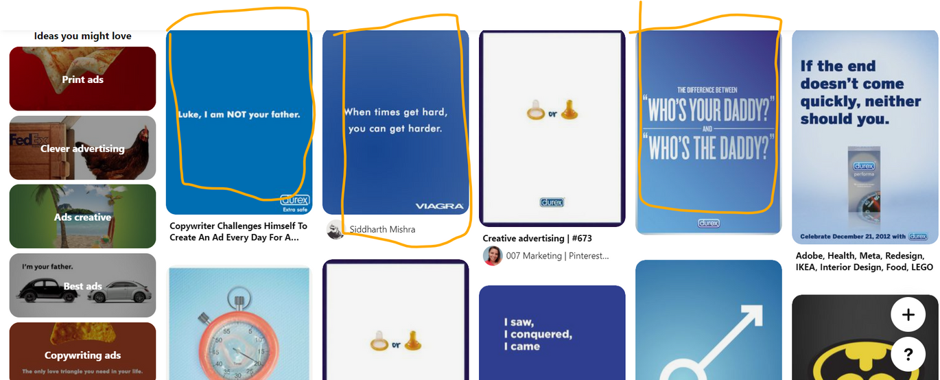
I looked out some Banners example and I was actually interested by the more simplistic looking ones.

I took several shots of some Milk Splash.
I then edited the images and removed the Backgrounds.

I tried to find much more sub-copies that I could use together with the 'Catch Your Splash'. I also had help to properly translate them in Malay cuz some of them had to be completely changed to sound good in Malay.

I was still deciding about the colours, so I made some templates to see the differents moods they provoke. I decided to go with the blue since it was more emotional and incite trust more, which is the whole point of the campaign.

From there I started editing the images. I did these 2 tryouts, and the lecturer actually recommended me to go with a consistent series based on the first banner since the one below looks too busy in terms of Layouts.

I then did many variations, changing the colour, changing the Layout slightly, I also used different sub-copies and different images from the batch I took.

I actually used an online colour wheel to make sure I respect the Design Principles. However, instead of using all the colours, it was offering me I decided to simply use some, as long as it was creating harmony within the composition.
I also went back, looking at my hierarchy, rule of thirds and layouting, since my layouts were never quite as good.

This eventually was my choice in terms of the art direction, typography and colours.

This was then one of the final pieces were, I've tried to give the layout some space to breathe, and add some emphasis here and there to show what's the banner is about. I also added a small description since the aim of the banner was to redirect people towards Aeon Mall, where the Vending Machine is located.

I then re-organize it to place it in its appropriate position around Kota Bharu.

And this is a mock-up of how it will look like in the right place.

After that, I started planning out the Website. This is the Sitemap.


Comments