Critical Trend Poster
- Ahmad Ahseek

- Oct 27, 2021
- 2 min read

We had a class about the trends that are going on in design. In the class, we were given a task about finding the trend that suits us more. The one that I was interested in was 3D typography. I mentioned how Stefan Sagmeister and Rafael Morgan likes exploring textures, which isn't related directly to 3D typography but could be in a way.
I also explain how the blender community is very active, thus many designers might be interested in trying it out. Since designers focus on typography a lot, 3D typography might become the trend.


We then had to create a small pdf to further talk about the trend that we chose. I tried to make it in a way that the text works with the 3D environment of the 3D typos.

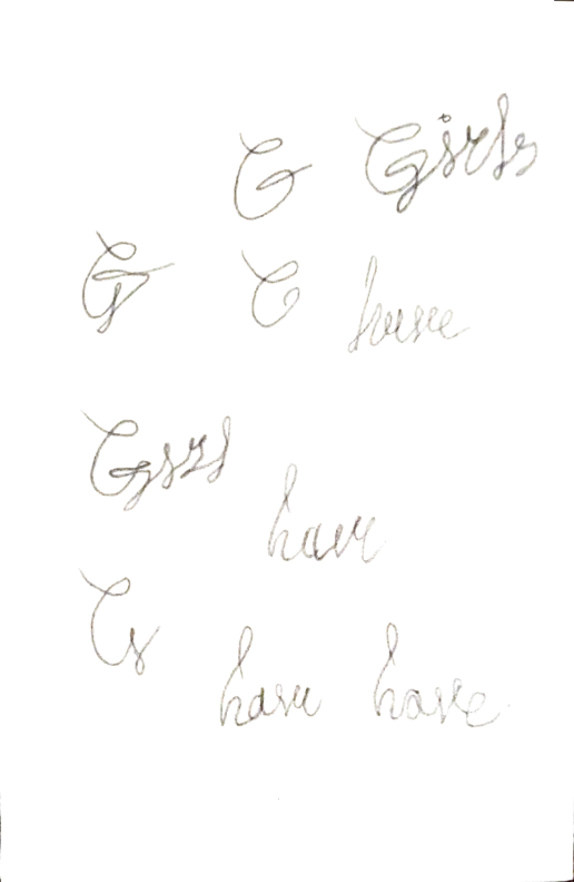
This is a small mindmap I did to create the mood and see what I want to express with the trend poster.
I decided to go with the copy 'Girls have Voice' inspired from some other copies such as 'Got milk' which is very simple yet catchy.
It is related to my Independent Brief by addressing the idea that women in Malaysia submit themselves to their dominant boyfriend/husband which is another aspect that contributes to Teenage pregnancy. So it is a bold statement that somehow shows the women that they have a voice they can use to fight back and that they don't have to submit themselves every time.
The 'Girls have' would be hand drawn while the 'Voice will be in Bold Capital Letters with the 'Bluto' font which is extremely thick and bold to depict strength.

Here's how I imagined the whole thing at first. Another suggestion was to have the 'Voice' in 3D but the 'Girls have' in 2D hanging somehow with a neon light.

These are the tryouts that I did for the 'Girls have' part. I tried to make it in a way that it is all attached so that I can make it easily on blender.


I rendered it with 2 different engines, Evee from blender itself and Cycles which is my Graphic card which was supposed to be of a higher quality.
There is a difference between the 2 engines in terms of the textures.
Furthermore, I actually had to simplify my design in a way since I lack the knowledge to edit the shape properly.
I chose the trendy colours as well but in a conceptual way, the pink was the charlotte pink to represent feminity, the orange was dahlia orange to represent strength, and the concrete and bold letter were to put more emphasis on strength.


Comments