External Brief Meeting
- Ahmad Ahseek

- Dec 11, 2021
- 1 min read
We actually had a meeting with the client before we add the final touches to the project. So I prepared a few stuffs based on my progress to present to him.

Since I was still unsure about my design I decided to do more sketches and more designs based on the sketch. I was going for simplicity at this point.


Then I used all of the icons I had and tried to apply it on the typeface. A lot were failures and the new simplified logo looks nothing like a fish or a droplet of water it also looks too rough, devoiding the icon of the idea of care.

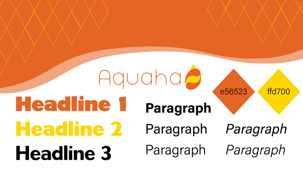


Eventually, I went for this design right here and I tried finding appropriate patterns to add details in the website. I went for diamond shapes since it relates to fish scales and I went for waves as divisions in the website since it relates to ocean.


Comments