External Project Progress to Pre-Final
- Ahmad Ahseek

- Nov 6, 2021
- 4 min read
Since I had to come up with a new name, one that will be easier for Chinese people to pronounce, I decided to start looking into Chinese word that is related to the theme.

I found many words, some of which are easier for Chinese people, but will actually be hard for others to pronounce. And other times, if I simplified the word, using just a portion of it, the whole meaning changed already.
The best proposal I had at this point was 'Hao' which means 'Good'. So I mixed it with 'Aqua' and I obtained 'Aquahao' which is very easy for anyone to pronounce, and it sounded quite catchy too.
Being very unfamiliar with Chinese language and customs, I decided to talk to the client first, who is Chinese.

He gave me some feedback saying he like the direction but he told me to verify with other Chinese to see if they get the meaning of the name.

My first choice was a Chinese teacher I found online but, she was actually trying to sell a Chinese course to me instead of helping me out, so I decided to move forward to a Chinese Friend.

I asked her how this word is usually used in a conversation and if it is similar to the English 'good' which often translate to 'well/healthy' in some cases.
She actually told me that it does work and when I gave her the name 'Aquahao' she responded extremely positively saying that it makes sense.


Now that I have a tested name and a concept, I decided to go with finding some inspiration.
I tried to find the Chinese way of Writing 'Hao', but if I chance the symbol it might form another word, so I decided to avoid playing with that.
Then I looked at some Healing Symbols, mostly from the Chinese/Japanese culture and some fish brand logos to see how I can merge them both.


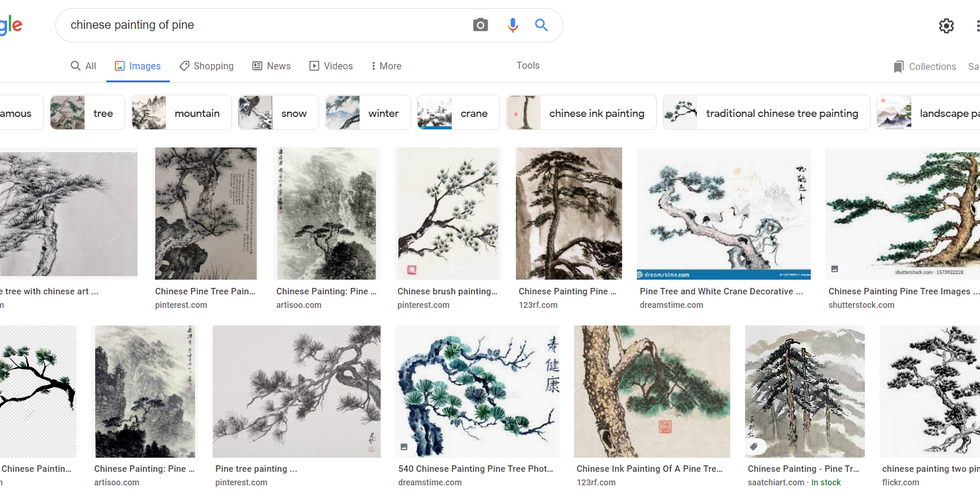
I also looked into some Chinese artwork of things they symbolizes as healing, vitality and so on, such as the crane, trees and leaves.


Then I did some sketches, using these symbols, artworks and part of the pompano and so on. I tried my best to simplify them, since they look very complex in terms of design.

I actually obtained this design that I quite enjoyed out of them all. It has the aspect of the pompano, resemble a fish and the curl on the right was inspired from the reiki symbol of healing.

I then started exploring different fonts. I found several that I like but non was exactly what I was looking for. So the 2 last tryouts, those that are not properly spaces, were custom made, inspired by the fonts that I found related to the concept of the brand.

I also explored some meanings behind some colours, both in the Chinese and Western culture. Red means happiness and good fortune in Chinese culture and Green is the same from both cultures, symbolizing, Renewal and Revival.


This was quite silly honestly, but I wanted to try my best to use only 2 colours for the whole website and logo. So I did, but it doesn't appeal nicely at all, so I decide to proceed by having white to create a sense of space in between the designs.

So I created my first moodboard. At this point, I still wanted to rework on the icon since it's not nicely curved. But I chose to go with orange and green since they both in a way relate to health.
At this point, I had a tutorial and my lecturer suggested me to go fully with the Chinese culture since it started to have this Chinese essence throughout the design but it still had some oddities. Furthermore, he mentioned that the icon was too complex and that the application of the icon with the typeface wasn't very professional, and that the icon should fuse nicely with the letterface.
He was also very kind to explain to me part of Chinese culture so that to help me further conceptualize the design. He explained how Chinese people focus on good fortune a lot and 'being well' to them means 'being wealthy and fortunate'. He directed me to the symbol of the 'Couple of Koi' which means abundance and good wealth and the relation of water to this symbolism.


Based on this new info I explored the depiction of the 'Couple of Koi' and the

And I came up with a new sketch. It is much more simplified but yet holds the meaning and concept behind it.

I then started designing it on Illustrator, but at this point the curves were not refined at all.

So I used circular shapes to design it and obtain those smooth curves.


Comments