Flag and Critical Thinking pt, 1
- Ahmad Ahseek

- Sep 18, 2021
- 4 min read
Since I like Stefan Sagmeister's work and analogue methodologies in design I decided to go with an idea that will allow me to do that.

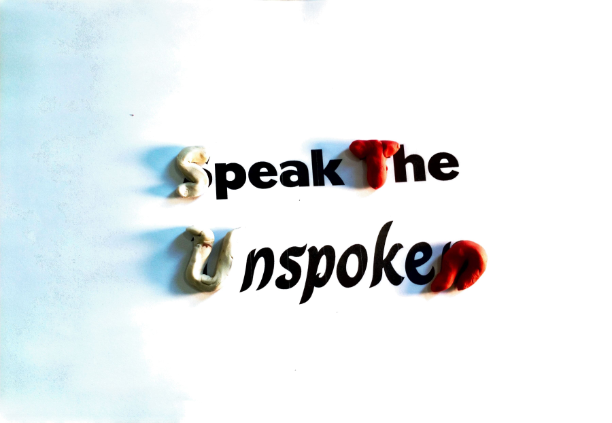
Firstly I worked on the quote. I found several quotes that could relate to the concept. From them all, I did like 'Go be the Voice' and 'Speak the Unspoken'. I think that 'Go be the Voice' sound very strong and bold but I was turn off by it since it was inspired by a song by Beartooth. 'Speak the Unspoken on the other hand sounds quite soft which could represent the empathizing (emotional) part of which I'm focusing on.

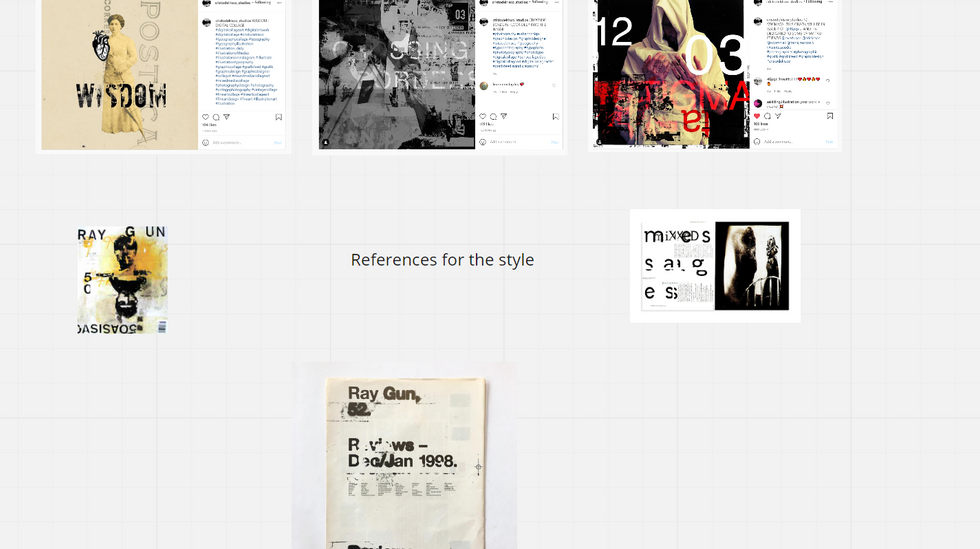
I wanted the design to have the messy style of Ray Gun or that previous designer I was about to interview, Cristo del Rico, from GD in Context last sem. It relates to Stefan Sagmeister's idea of having an organic form of design since it consists of an analogue method.

I was also planning to work on some photographic pieces. This wasn't my inspiration but more the photoshop methods that I was expecting to use to achieve the effect I had in mind which I will explain in a bit.

These were the fonts that I found related to my theme since they were bold. The 2 small ones with the white background have both the emotional aspects with curves but are still bold enough.

Here are some images I took to be used as either textures or elements along with the typo. I wanted to have as much primary resources as I could.

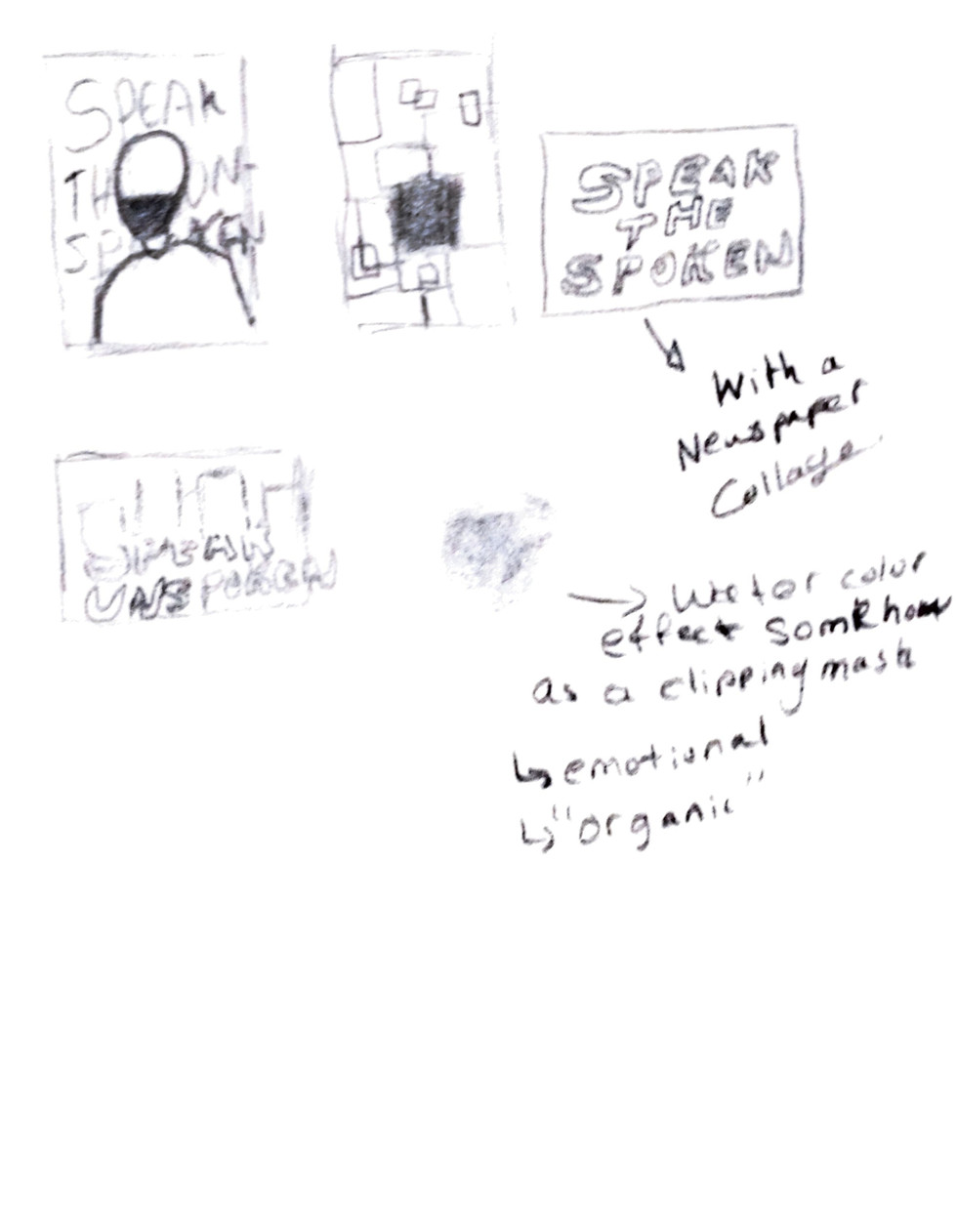
Here are 3 ideas I sketched. The first one is a photographic piece that has a typo written in the background. It has a figure with a painted mouth to represent the idea of being voiceless. The other ideas are just typographic pieces or visual pieces. The middle one was an idea I explained in an earlier post. It basically depicts the idea of an explosion of squares to show the idea of being bold and voicing oneself out.

Here's an accurate digital sketch of how the photographic piece will look like. Basically, I chose to go with a dispersion effect like the photoshop method I showed earlier. However, the way the image will disperse, it will also have a fading and it will be made out of watercolour to have this emotional feel to it to depict empathy. Additionally, there will be the texture of the electric stairs I took earlier.

I wanted it to be a photographic piece like the ones I use to do during my free time. Furthermore, I also think that this way it could also relate to Stefan Sagmeister's practice whereby he wrote on himself. I also wanted to experiment with ideas where I would write over myself.


I did some watercolour on paper and I also did a watercolour with coffee for another idea I got in mind during the process with coffee to obtain that brown colour and those very soft foggy textures. I eventually scan them with different filters and light effects in my room. There's one last one I did with a red colour where I tried to use an almost dry brush to get the strokes of the brush on the paper.


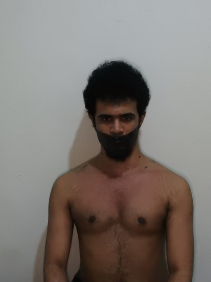


I painted myself in different ways with acrylic paint and I took several shots again with different lighting adjustments and posters.


These were the waste produced by me cleaning myself up every time with tissue paper to do a new painting on myself or to correct a mistake. I decided to keep it and use it as a texture in my work as well 😁.


I also find it the perfect time to revisit the technique I learnt during my GDinC part 1 where I learnt to play with typography in a physical manner. I obtained an effect back then that looked quite cloudy or like watercolour which I think could fit this theme. Since I'm using watercolour to depict emotions/empathy.
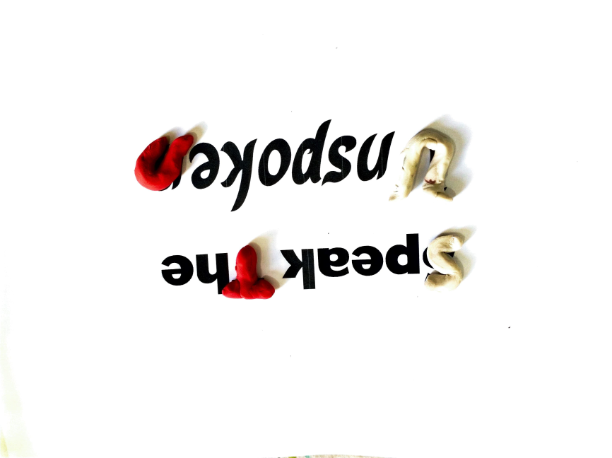
I actually forgot how to obtain this effect but after revisiting the past I saw that I actually got it from the shadow of the text. So I try various ways to apply some shadows on the text with moulding clay and the tiny figurines I made in the first sem.


I also tried to make a square with the square objects I had at home to try and make the idea with the squares but in a more interesting way.
From what I presented during the tutorial I was recommended to look into Dave Mckean and Patrick Thomas from the direction I was going for.

This is the final piece for the very first poster I suggested, which actually does have some similarities with Dave Mckean's works.


These 2 were very Stefan Sagmeister influenced since they had the typography written on the figure. These ones only had a quick lightroom treatment and they were ready to go.

This one is a more personalized design inspired by Stefan Sagmeister. I like the coldness and it also has the watercolour effect.

This is the effect I was trying to obtain with the shadows. I didn't paint it it's the original organic colours of the scanned shadows. It's just accentuated with the smudge tool in photoshop and nothing more.


This was the piece that I wanted to do from the previous post. It wasn't intended for it to look like a tv, but I think it helps with the concept. Like speaking what the media ain't talking about.


Comments