Grad Show (Finale)
- Ahmad Ahseek

- Sep 11, 2021
- 3 min read


From last time I did some experimentation with the typeface itself. I've tried my best not to include any square element as such. Eventually, I came up with the design in the last image which I was more satisfied with. I've tried various ways of using it, adding an outline, changing the outline's colo and changing the colour of the separated letters. I think that the one with the red outline and creamy brown on the upper half was more suitable.


I thought that the design look quite simple still, so I began researching and I found out that a lotus symbolizes positivity. Thus creating a relation with the project. So I sketched a few ideas trying to make it abstract but still understandable.

This was one of my references for the lotus. I thought that a basic tattoo shape would be more suitable.


Then I switched to AI. I did one with the lower part which looked more interesting to me but then when I applied it to the logo I found that it's better without. I also experiment with a white outline and the outlines only didn't look too great.

This was the new mood board. I've simplified it a lot. I was first thinking of using only 2 colours, like my lecturer suggested, however since the logo look better with the red outline I included the red colour.

But by itself I wanted the logo to be centre aligned. However, when it's used with the icon it will be either right or left aligned accordingly.


Here's how the icon will look like in practice. If we're doing a sort of poster or invitation card it could include both. For graphics and posters, it might include just the typeface and for merchandise, since the space is limited it could include the icon only.


These are the designs only which were very simple actually.


I was suggested to work on some icons to strengthen the idea. Like supporting graphics. So I started off making vector icons of all the things I could relate to a graphic designer. Since I wasn't very satisfied with it I did other in a simple black fill. There's also an icon that I was preserving for a small animation for the presentation.

Here are the sketches for the icons. I also had half of a shaking hand but I realized that the shape might become too abstract in the end.


Since the lecturer wasn't satisfied with the logo during our meeting, I started experimenting again. This time I played with the sizes, the spaces, the offset and I even did one on a curved path.

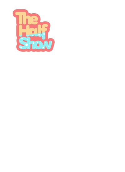


I did a series of tryouts with the most promising ones. I also tried different alignments on the boards to see how they look and how they could be applied. I actually preferred the last one with the curve. It has this very joyful appeal to it. And I did what I was recommended to do, to remove the spaces between the letters.


Comments